
These are a few examples of travel layouts for a magazine or newspaper.
All images or graphics I made or took myself. I used InDesign to create the pages and Photoshop to edit any photos and create the graphics.
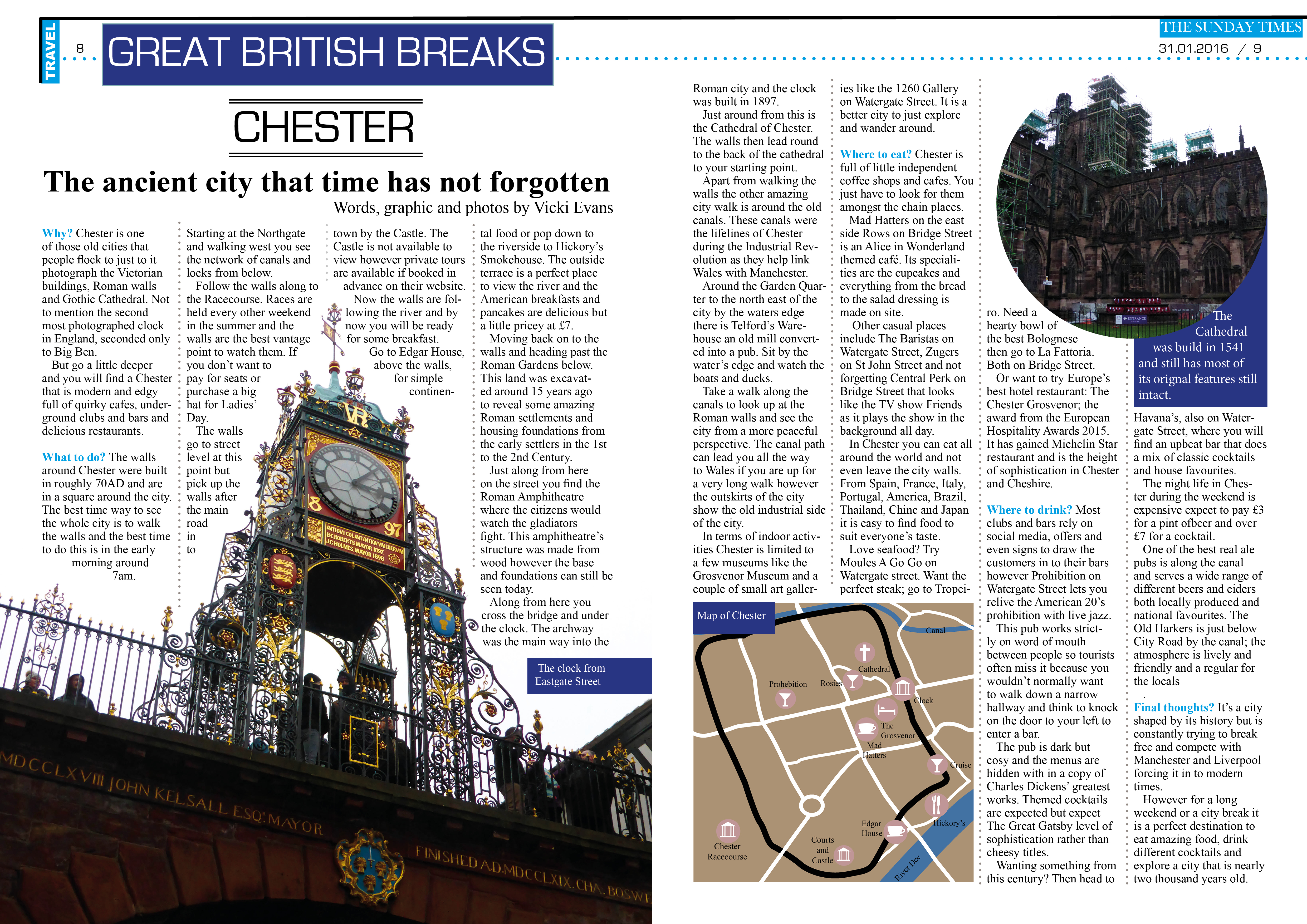
This design is based off the Sunday Times ‘Great British Breaks’ articles. This one also has the full copy in the layout. The graphic at the bottom I designed using photoshop and was in the style of The Sunday Times maps.
These next few are designed and use filler text for the story.
The first is form Albufeira, Portugal. The key was to have the beautiful relaxing beach as the focal point and give an overview of the feel of the town using the side bar of different images.

Derwentwater piece focus is the panorama shot at the bottom. Using such a large image can mean that the text is lost through the picture so using two columns and making the text very blocky mean that the text is not lost in the image.

This DPS of Venice I feel would be a typical weekend travel piece with the entire right hand page being full of photos to give a good fell for the place and the left hand page being full with text.

